
"Silver and Blue, silver and blue, everyone wishes for silver and blue."
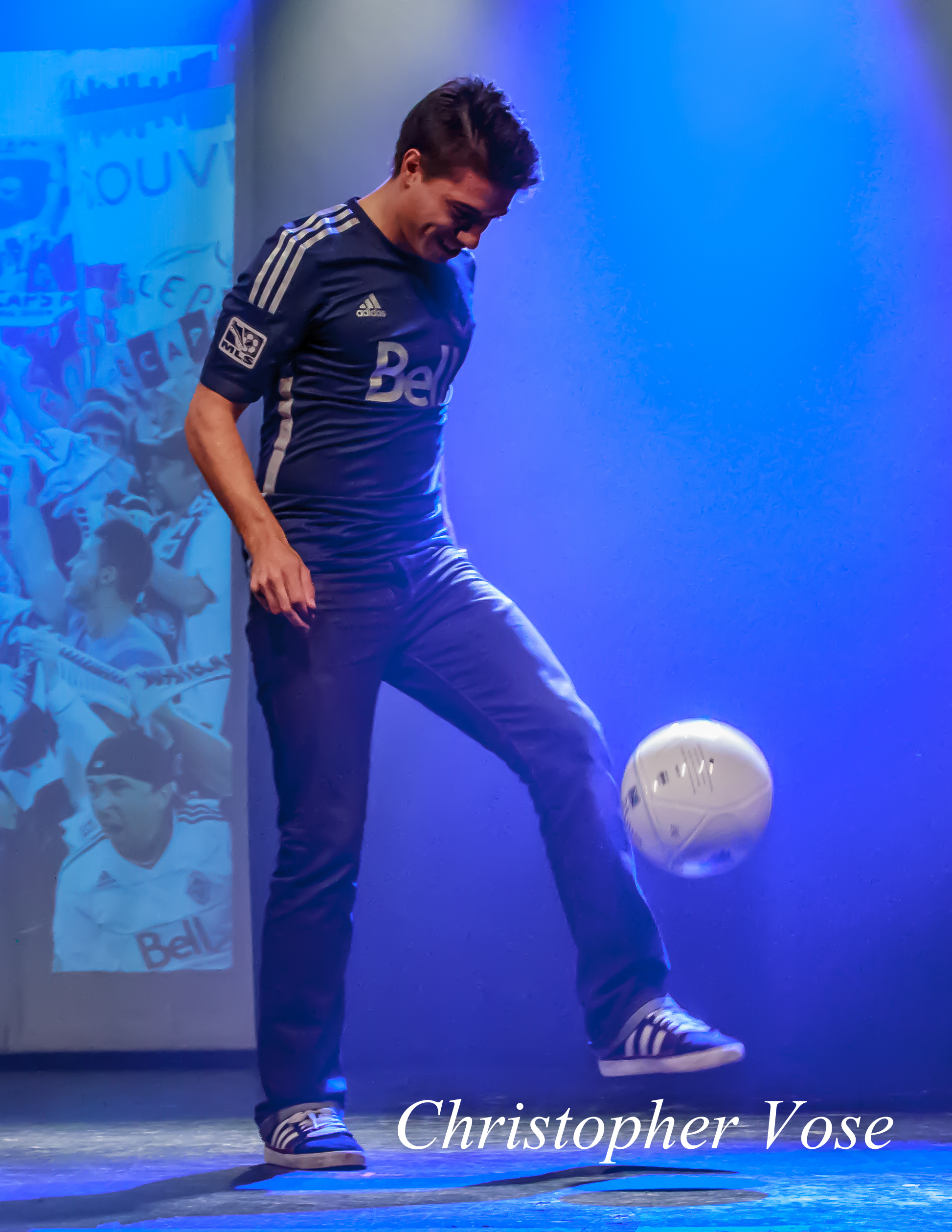
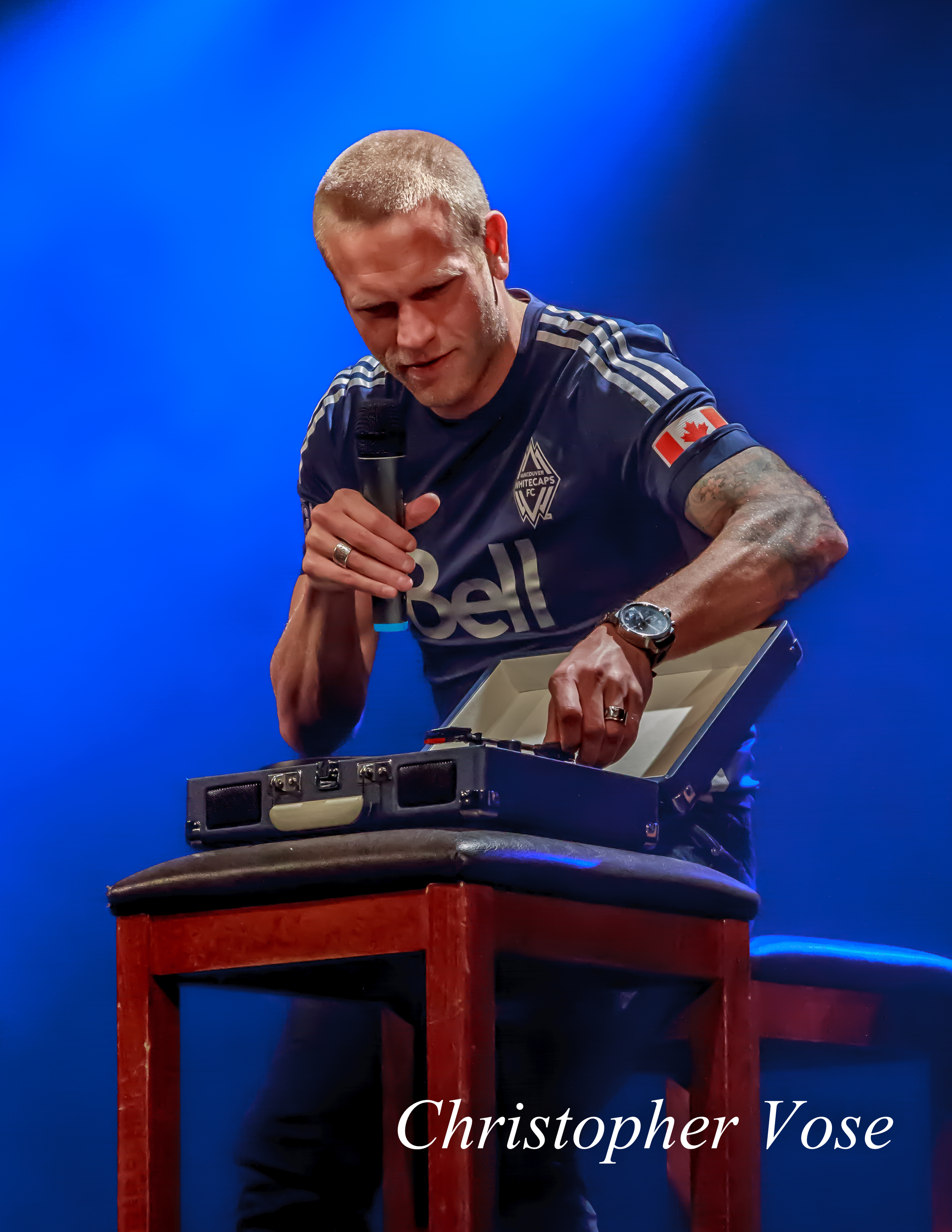
The Whitecaps unveiled their new away kit Wednesday night at the Commodore Ballroom in an event hosted by TSN's Jason de Vos and Luke Wileman.
The kit has a lot to live up to, as its predecessor, first introduced in 2011, was widely regarded as one of the best kits in Major League Soccer. Columnist Simon Borg ranked it number one as recently as 2013.
"My favourite jersey is the Vancouver Whitecaps secondary kit from 2011," said Borg. "I'm talking about that dark blue one, really classy, and it has those diamond patterns around it, really good look, and then the Bell logo, that's their sponsor. That white across the middle really makes it look sharp. I'll take mine in a long sleeve, thank you."
The 2014 kit is the same blue as before, in what the Whitecaps refer to as Deep Sea Blue. But with the exception of the Canadian flag, all traces of white have been replaced with silver.
The silver represents the six championships and seven league cups that the club has to its name. And that's before you include the four Cascadia Cups, and one each of the North American Club Championship, Nations Cup, Walt Disney World Pro Soccer Classic, and the Rose City Invitational.
The club plan to wear the new kit 15 times this season, eight of which will be at home, with the first coming on 8 March against New York.
By choosing silver, the club have thrown down the gauntlet and announced their ambitions. In that, it is fitting that their first opponent would be the reigning MLS Cup winners, who get to play with a silver ball in home matches this year.
As for their third kit, it has all but disappeared completely from their presence on the web and in stores. Could we see a second kit unveiled this year?
We hope so. The 40th anniversary is the ruby anniversary, and wouldn't it be nice for the club to introduce a kit bearing the same colours as they wore from 1974 to 1978?